Who in the rainbow can draw the line where the violet tint ends and the orange tint begins? Distinctly we see the difference of the colors, but where exactly does the one first blendingly enter into the other? So with sanity and insanity.
—Herman Melville, Billy Budd
Orange, red? I don’t know what to believe anymore!
—Anonymous, Color Survey
I WILL EAT YOUR HEART WITH A FUCKING SPOON IF YOU AKS ANY MORE QUESTIONS ABOUT COLORS
—Anonymous, Color Survey
Thank you so much for all the help on the color survey. Over five million colors were named across 222,500 user sessions. If you never got around to taking it, it’s too late to contribute any data, but if you want you can see how it worked and take it for fun here.
First, a few basic discoveries:
- If you ask people to name colors long enough, they go totally crazy.
- “Puke” and “vomit” are totally real colors.
- Colorblind people are more likely than non-colorblind people to type “fuck this” (or some variant) and quit in frustration.
- Indigo was totally just added to the rainbow so it would have 7 colors and make that “ROY G. BIV” acronym work, just like you always suspected. It should really be ROY GBP, with maybe a C or T thrown in there between G and B depending on how the spectrum was converted to RGB.
- A couple dozen people embedded SQL ‘drop table’ statements in the color names. Nice try, kids.
- Nobody can spell “fuchsia”.
Overall, the results were really cool and a lot of fun to analyze. There are some basic limitations of this survey, which are discussed toward the bottom of this post. But the sheer amount of data here is cool.
Sex
By a strange coincidence, the same night I first made the color survey public, the webcomic Doghouse Diaries put up this comic (which I altered slightly to fit in this blog, click for original):

It was funny, but I realized I could test whether it was accurate (as far as chromosomal sex goes, anyway, which we asked about because it’s tied to colorblindness) [Note: For more on this distinction, see my follow-up post]. After the survey closed, I generated a version of the Doghouse Diaries comic with actual data, using the most frequent color name for the handful of colors in the survey closest to the ones in the comic:

Basically, women were slightly more liberal with the modifiers, but otherwise they generally agreed (and some of the differences may be sampling noise). The results were similar across the survey—men and women tended on average to call colors the same names.
So I was feeling pretty good about equality. Then I decided to calculate the ‘most masculine’ and ‘most feminine’ colors. I was looking for the color names most disproportionately popular among each group; that is, the names that the most women came up with compared to the fewest men (or vice versa).
Here are the color names most disproportionately popular among women:
- Dusty Teal
- Blush Pink
- Dusty Lavender
- Butter Yellow
- Dusky Rose
Okay, pretty flowery, certainly. Kind of an incense-bomb-set-off-in-a-Bed-Bath-&-Beyond vibe. Well, let’s take a look at the other list.
Here are the color names most disproportionately popular among men:
- Penis
- Gay
- WTF
- Dunno
- Baige
I … that’s not my typo in #5—the only actual color in the list really is a misspelling of “beige”. And keep in mind, this is based on the number of unique people who answered the color, not the number of times they typed it. This isn’t just the effect of a couple spammers. In fact, this is after the spamfilter.
I weep for my gender. But, on to:
RGB Values
Here are RGB values for the first 48 out of about a thousand colors whose RGB values (across the average monitor, shown on a white background) I was able to pin down with a fairly high degree of precision:

The full table of 954 colors is here, also available as a text file here (I have no opinion about whether it should be used to build a new X11 rgb.txt except that seems like the transition would be a huge headache.)
The RGB value for a name is based on the location in the RGB color space where there was the highest frequency of responses choosing that name. This was tricky to calculate. I tried simple geometric means (conceptually flawed), a brute force survey of all potential center points (too slow), and fitting kernel density functions (math is hard). In the end, I used the average of a bunch of runs of a stochastic hillclimbing algorithm. For mostly boring notes on my data handling for this list, see the comments at the bottom of the xkcd.com/color/rgb/ page.
Spelling and Spam
Spelling was an issue for a lot of users:

Now, you may notice that the correct spelling is missing. This is because I can’t spell it either, and when running the analysis, used Google’s suggestion feature as a spellchecker:

A friend pointed out that to spell it right, you can think of it as “fuck-sia” (“fuch-sia”).
Misspellings aside, a lot of people spammed the database, but there were some decent filters in place. I dropped out people who gave too many answers which weren’t colors used by many other people. I also looked at the variation in hue; if people gave the same answer repeatedly for colors of wildly varying hue, I threw out all their results. This mainly caught people who typed the same thing over and over. Some were obviously using scripts; based on the filter’s certainty, the #1 spammer in the database was someone who named 2,400 colors—all with the same racial slur.
Map
Here’s a map of color boundaries for a particular part of the RGB cube. The data here comes from a portion of the survey (1.5 million results) which sampled only this region and showed the colors against both black and white backgrounds.
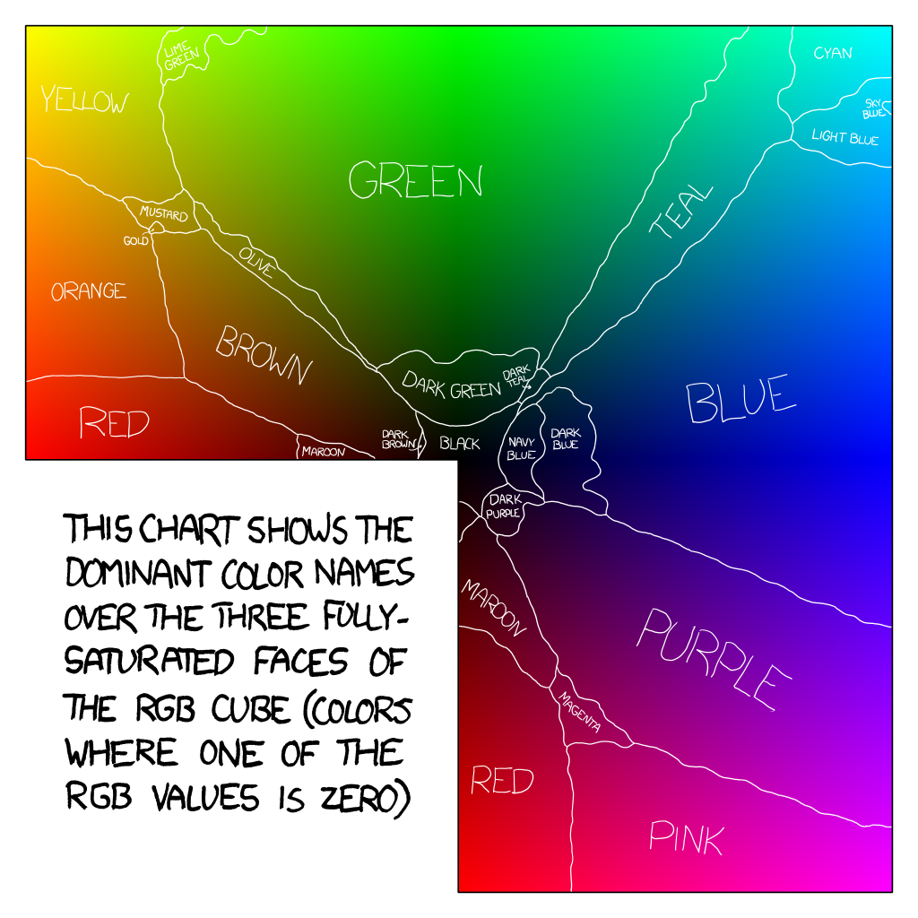
The data for this chart is here (3.6 MB text file with each RGB triplet named). Despite some requests, I’m not planning to make a poster of any of this, since it seems wrong to take advantage of all this volunteer effort for a profit; I just wanted to see what the results looked like. You’re welcome to print one up yourself (huge copy here), but keep in mind that print color spaces are different from monitor ones.
Basic Issues
Of course, there are basic issues with this color survey. People are primed by the colors they saw previously, which adds overall noise and some biases to the data (although it all seemed to even out in the end). Moreover, monitors vary; RGB is not an absolute color space. Fortunately, what I’m really interested in is what colors will look like on a typical monitors, so most of this data is across the sample of all non-colorblind users on all types of monitors (>90% LCD, roughly 6% CRT).
Color is a really fascinating topic, especially since we’re taught so many different and often contradictory ideas about rainbows, different primary colors, and frequencies of light. If you want to understand it better, you might try the neat introduction in Chapter 35 ofThe Feynman Lectures on Physics (Vol. 1), read Charles Poynton’s Color FAQ, or just peruse links from the Wikipedia article on color. For the purposes of this survey, we’re working inside the RGB space of the average monitor, so this data is useful for picking and naming screen colors. And really, if you’re reading this blog, odds are you probably—like me—spend more time looking at a monitor than at the outdoors anyway.
Miscellaneous
Lastly, here are some assorted things people came up with while labeling colors:

Thank you so much to relsqui for writing the survey frontend, and to everyone else who sacrificed their eyeballs for this project. If you have ideas and want to analyze these results further, I’ve posted the raw data as an SQLite dump here (84 MB .tar.gz file). It’s been anonymized, with IPs, URLs, and emails removed. I also have GeoIP information; if you’d like to do geocorrelation of some kind, I’ll be providing a version of the data with basic region-level lat/long information (limited to protect privacy) sometime in the next few days. Note: The ColorDB data is the main survey. The SatOnly data is the supplementary survey covering only the RGB faces in the map, and was presented on a half-black half-white background.)
And, of course, if you do anything fun with this data, I’d love to see the results—let me know at xkcd@xkcd.com.

That color map is practically designed for colorblind digital artists (one of whom I’ve already passed this on to). Not only that, but it conveniently accounts for variations in monitor color temps. Thank you for being one of the craziest nerds with a passion for visualization of data ever. You’ve done the world yet another service.
LikeLike
That quote anout eating your heart was me :S.
I have to say that I didn’t think you would publish it lol.
It just kept goinf on and on and I needed to do coursework but I
couldn’t tear myself away!
Feel free to post my name next to it XD
LikeLike
My favorite color name is for lipstick … “IT’S RED YOU CRAZY BITCH!”
LikeLike
I can understand not wanting to make profit from the color map, but what if the proceeds were donated? I’m color deficient [kind of like color blind, but less] and think it would look great in my kitchen!
LikeLike
I find it interesting how to color Salmon is only widely recognized by guys.
LikeLike
I love how you tackle what most would consider noise and make it part of the data. The colour description “Dunno” make me laugh each time I refer back to this post.
When you say “this is after the spamfilter” did you do any analysis before the filter, to see if any colours were correlated with any swear words?
LikeLike
I LOVE that there is a difference between *poop* brown, *poo* brown, and shit. HAhahaha. I too went a bit Color-crazy after about 2 hours of the survey.
LikeLike
Given your this interest in colour you should definitely read “Shades of Grey” by Jasper Fforde
LikeLike
i’m tempted to download the sql-data and have a look at it, but i got to learn for my Abitur (it’s like the A-Levels or something) and i know i would spend hours beeing fascinated and klicking through the results.
great job!
LikeLike
Possessed, possessed by color. OCD perhaps? I really like the map of color boundaries. A poster would be great. Of course, even if you made it free for download, someone would try to sell it for profit.
LikeLike
Hey, I design UIs and would like to have a complete version of that color map picture, that is, without the rectangle in the lower left-hand corner? I would make it myself using the text file, but don’t have the time. Thanks!
LikeLike
I’d like a map of the popular names for colors without the text in the bottom-left corner so the Red Nation and Maroon Republic can match up with their other halves.
LikeLike
It definitely debunks the Doghouse Diaries unscientifically based stereotypes..
LikeLike
I am going to attempt to turn the text dump of the colors into an ArcGIS style. The ESRI mapping center told me they would post the style on their site if I made it. So look out any geographers who read XKCD. I did have to run it through some python to get RGB values because ArcMap doesnt accept HEX colors.
LikeLike
Haha a puke can be a color… gooood….
LikeLike
A totally far-out survey. I suspected differences between sexes, but did you have any with respect to age, sexual preference, profession, and/or other considerations?
Cheers,
tedd
LikeLike
woohoo – gotta love this color talk!!! this uncanny topic infiltrates our lives from A to Z. odd how little attention is paid to the study of color with its great scope of facets. time to remedy this – a win/win for all concerned…
LikeLike
I like that only guys define ‘salmon’…I think that it’s an excuse to wear pink shirts without calling them pink…
LikeLike
Very amusing. 🙂
What if comparisons came into the picture? A green by itself is obviously just “green”, but if people saw different greens side by side, would they still call them all “green”?
LikeLike
I love how men distinguish salmon from other shades of pink, and women don’t.
It’s not pink, it’s salmon!
LikeLike
Oh, hey! I was going to note that I know my answers were skewed by the good folks who name Crayola Crayons, but others have as well. That would be a fun test to run–how many colors correspond with silly Crayola names like Jungle Green and Macaroni and Cheese (the latter of which, oddly, was my favorite color to use, pressing lightly, to emulate the color of my own skin).
LikeLike
Sheer laughs and some fun info!
LikeLike
What if you were told that green is actually blue, and red and yellow were swapped? would this study have been as much fun?
This is a really cool post, I think the colour map with ‘mostly used colour names’ is a work of art in itself. It should be super-sized and sold to creative agencies and made as posters on the wall.
I like this!
LikeLike
If anyone want it, I just made a simple java class with all the xkcd colors so you can use them in your applications.
http://www.2shared.com/file/DfZH1OBn/XkcdColor.html
*Note: for names with a “/” in them, I just replaced it with “Slash”
LikeLike
I was thinking about the stereotype of guys and colour names when someone first mentioned the survey – but while I was trying to do it, 4 other guys crowded round and started yelling their ideas for the colour names. Theirs were a heck of a lot more detailed than mine – while I thought “pink” or “green” they’d shout “lightish salmon!” or “mint!” then *fight about the differences in their descriptions*.
I can’t think of any reason that these guys would all buck the trend – they’re geeks aged 16-25, which you’d think is XKCD’s core readership – two of them aren’t straight, but neither am I…
LikeLike
Probably already said (I didn’t read all the comments):
Fuchs is German for fox, so at least all German speakers (Germans, and maybe even Bavarians, Austrians and Swiss people) should have got the fuchsia one right.
It seems to be a common mistake among English speakers to spell words that sound similar to fuck wrong. At least I get a lot of spelling errors on IRC, forums and mailing lists. Maybe some kind of Freudian slip.
Kind regards,
Fuchs
LikeLike
you and your sacrosant notes…
the colours in the rainbow are what they are supposed to be… blended with one another!
mix them all together and you get the most simplest of all colours… blanca….
WHITE
LikeLike
In the same spirit as the Silverlight-based Web picker and the Java class already posted, I made a color list for the Mac OS X systemwide color picker, available at http://github.com/willmo/colors/raw/master/xkcd Colors.clr . Download that file and plop it in ~/Library/Colors/ (to install it for just yourself) or /Library/Colors/ (to install it for all users on the machine). You might have to create the folder if it doesn’t already exist.
Once you have that installed, launch an app and check the third tab of the color picker. At the top is a pop-up menu of palettes; you should see xkcd Colors show up there.
I’ve sorted the colors with the most popular one at the top (opposite of how they are in rgb.txt), but of course I could change that.
Enjoy!
(Randall: how come rgb.txt promises 954 colors but only has 949 lines?)
LikeLike
Oops. Try this link instead.
LikeLike
wow… as if gender roles weren’t prominent enough…. someone has to post something entirely relative and make it gender specific…. niiiice
LikeLike
Soon there will be such colors as “cup of the with two spoons of milk and a little bit of sugar” 😛
LikeLike
“Basic Issues
Of course, there are basic issues with this color survey.”
Yeah, you misspelt colour. 😛
LikeLike
i was interesting to read the results, but i must say that
“fucsia” is also a the right way to spell the color (in spanish), also, i typed fuchsia when i came up in the survey, i used the help of google for that one, ’cause, since mother tongue is Spanish i wasn’t sure about the english spelling of that one, maybe i got filtered or something, any way, really nice test, it was fun, and solve my doubts about whatever or not i was seen the colors the way every one else was .
LikeLike
lol… blue with a hint of your mom
LikeLike
Late to the party but just ran across this and it cracked me up. Brilliant!!
LikeLike
😦 wish I had taken part in this. I love color, and I’d be one of the guys giving girl-type color answers like Teal and light-green.
LikeLike
yea…. about that GeoIP…. I was behind seven proxies….
LikeLike