Who in the rainbow can draw the line where the violet tint ends and the orange tint begins? Distinctly we see the difference of the colors, but where exactly does the one first blendingly enter into the other? So with sanity and insanity.
—Herman Melville, Billy Budd
Orange, red? I don’t know what to believe anymore!
—Anonymous, Color Survey
I WILL EAT YOUR HEART WITH A FUCKING SPOON IF YOU AKS ANY MORE QUESTIONS ABOUT COLORS
—Anonymous, Color Survey
Thank you so much for all the help on the color survey. Over five million colors were named across 222,500 user sessions. If you never got around to taking it, it’s too late to contribute any data, but if you want you can see how it worked and take it for fun here.
First, a few basic discoveries:
- If you ask people to name colors long enough, they go totally crazy.
- “Puke” and “vomit” are totally real colors.
- Colorblind people are more likely than non-colorblind people to type “fuck this” (or some variant) and quit in frustration.
- Indigo was totally just added to the rainbow so it would have 7 colors and make that “ROY G. BIV” acronym work, just like you always suspected. It should really be ROY GBP, with maybe a C or T thrown in there between G and B depending on how the spectrum was converted to RGB.
- A couple dozen people embedded SQL ‘drop table’ statements in the color names. Nice try, kids.
- Nobody can spell “fuchsia”.
Overall, the results were really cool and a lot of fun to analyze. There are some basic limitations of this survey, which are discussed toward the bottom of this post. But the sheer amount of data here is cool.
Sex
By a strange coincidence, the same night I first made the color survey public, the webcomic Doghouse Diaries put up this comic (which I altered slightly to fit in this blog, click for original):

It was funny, but I realized I could test whether it was accurate (as far as chromosomal sex goes, anyway, which we asked about because it’s tied to colorblindness) [Note: For more on this distinction, see my follow-up post]. After the survey closed, I generated a version of the Doghouse Diaries comic with actual data, using the most frequent color name for the handful of colors in the survey closest to the ones in the comic:

Basically, women were slightly more liberal with the modifiers, but otherwise they generally agreed (and some of the differences may be sampling noise). The results were similar across the survey—men and women tended on average to call colors the same names.
So I was feeling pretty good about equality. Then I decided to calculate the ‘most masculine’ and ‘most feminine’ colors. I was looking for the color names most disproportionately popular among each group; that is, the names that the most women came up with compared to the fewest men (or vice versa).
Here are the color names most disproportionately popular among women:
- Dusty Teal
- Blush Pink
- Dusty Lavender
- Butter Yellow
- Dusky Rose
Okay, pretty flowery, certainly. Kind of an incense-bomb-set-off-in-a-Bed-Bath-&-Beyond vibe. Well, let’s take a look at the other list.
Here are the color names most disproportionately popular among men:
- Penis
- Gay
- WTF
- Dunno
- Baige
I … that’s not my typo in #5—the only actual color in the list really is a misspelling of “beige”. And keep in mind, this is based on the number of unique people who answered the color, not the number of times they typed it. This isn’t just the effect of a couple spammers. In fact, this is after the spamfilter.
I weep for my gender. But, on to:
RGB Values
Here are RGB values for the first 48 out of about a thousand colors whose RGB values (across the average monitor, shown on a white background) I was able to pin down with a fairly high degree of precision:

The full table of 954 colors is here, also available as a text file here (I have no opinion about whether it should be used to build a new X11 rgb.txt except that seems like the transition would be a huge headache.)
The RGB value for a name is based on the location in the RGB color space where there was the highest frequency of responses choosing that name. This was tricky to calculate. I tried simple geometric means (conceptually flawed), a brute force survey of all potential center points (too slow), and fitting kernel density functions (math is hard). In the end, I used the average of a bunch of runs of a stochastic hillclimbing algorithm. For mostly boring notes on my data handling for this list, see the comments at the bottom of the xkcd.com/color/rgb/ page.
Spelling and Spam
Spelling was an issue for a lot of users:

Now, you may notice that the correct spelling is missing. This is because I can’t spell it either, and when running the analysis, used Google’s suggestion feature as a spellchecker:

A friend pointed out that to spell it right, you can think of it as “fuck-sia” (“fuch-sia”).
Misspellings aside, a lot of people spammed the database, but there were some decent filters in place. I dropped out people who gave too many answers which weren’t colors used by many other people. I also looked at the variation in hue; if people gave the same answer repeatedly for colors of wildly varying hue, I threw out all their results. This mainly caught people who typed the same thing over and over. Some were obviously using scripts; based on the filter’s certainty, the #1 spammer in the database was someone who named 2,400 colors—all with the same racial slur.
Map
Here’s a map of color boundaries for a particular part of the RGB cube. The data here comes from a portion of the survey (1.5 million results) which sampled only this region and showed the colors against both black and white backgrounds.
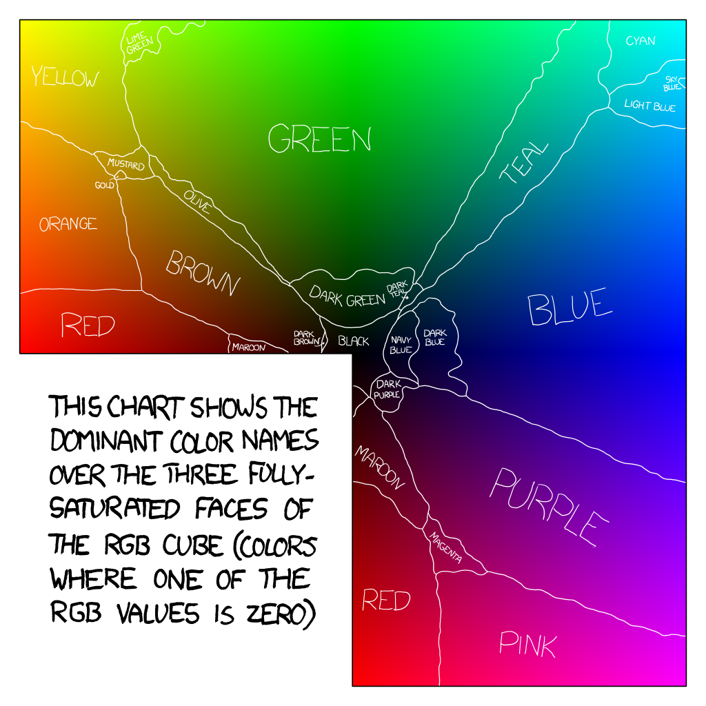
The data for this chart is here (3.6 MB text file with each RGB triplet named). Despite some requests, I’m not planning to make a poster of any of this, since it seems wrong to take advantage of all this volunteer effort for a profit; I just wanted to see what the results looked like. You’re welcome to print one up yourself (huge copy here), but keep in mind that print color spaces are different from monitor ones.
Basic Issues
Of course, there are basic issues with this color survey. People are primed by the colors they saw previously, which adds overall noise and some biases to the data (although it all seemed to even out in the end). Moreover, monitors vary; RGB is not an absolute color space. Fortunately, what I’m really interested in is what colors will look like on a typical monitors, so most of this data is across the sample of all non-colorblind users on all types of monitors (>90% LCD, roughly 6% CRT).
Color is a really fascinating topic, especially since we’re taught so many different and often contradictory ideas about rainbows, different primary colors, and frequencies of light. If you want to understand it better, you might try the neat introduction in Chapter 35 ofThe Feynman Lectures on Physics (Vol. 1), read Charles Poynton’s Color FAQ, or just peruse links from the Wikipedia article on color. For the purposes of this survey, we’re working inside the RGB space of the average monitor, so this data is useful for picking and naming screen colors. And really, if you’re reading this blog, odds are you probably—like me—spend more time looking at a monitor than at the outdoors anyway.
Miscellaneous
Lastly, here are some assorted things people came up with while labeling colors:

Thank you so much to relsqui for writing the survey frontend, and to everyone else who sacrificed their eyeballs for this project. If you have ideas and want to analyze these results further, I’ve posted the raw data as an SQLite dump here (84 MB .tar.gz file). It’s been anonymized, with IPs, URLs, and emails removed. I also have GeoIP information; if you’d like to do geocorrelation of some kind, I’ll be providing a version of the data with basic region-level lat/long information (limited to protect privacy) sometime in the next few days. Note: The ColorDB data is the main survey. The SatOnly data is the supplementary survey covering only the RGB faces in the map, and was presented on a half-black half-white background.)
And, of course, if you do anything fun with this data, I’d love to see the results—let me know at xkcd@xkcd.com.

You didn’t say what racial slur was so often submitted, but I can guess. Pity. Actually, there might be room for some research there. Black people have (or so I have heard from reliable sources) a highly sensitive and discriminating visual sense, at least when compared to Europeans. I’ll bet they’d be super at discriminating among similar colors.
LikeLike
I didn’t do many colors myself, I got bored after maybe 15 or so. That being said, most of my color names were inspired by the Crayola “Big Box” I had as a kid. I wonder if there’s any correlation in the data with that, because I doubt I’m the only one.
LikeLike
Thank you Randall, I can no longer identify colors.
LikeLike
Thought this was applicable, and pretty funny in an ironic sort of way.
http://www.omg-facts.com/view/Facts/3163
LikeLike
Thought this was relevant, and funny in an ironic sort of way.
http://www.omg-facts.com/view/Facts/3163
LikeLike
Wow. My ‘Gay’ color actually was decent in my post.
I make Randal ashamed. =3
LikeLike
I remember because of Mickey Maguire and his inability to pronounce letters … it’s not pink it’s fuss-chi-a
http://www.channel4.com/programmes/shameless/articles/mickey-maguire
LikeLike
Fuchsia is named for a flower which, in turn, was named (by Charles Plumier in 1703) after the German botanist Leonhart Fuchs (who died 137 years earlier). So, don’t curse, just spell it in German. Fuchs-ia.
http://en.wikipedia.org/wiki/Fuchsia
(I, too, weep for my gender.)
LikeLike
…apparently, according to your survey results, I am more suitable as a male than a female…I am not sure how to respond to this.
LikeLike
Whatever happened to octarine? Pratchett fans must be a dying breed.
LikeLike
I just like that “Puke Green” is different than “Baby Puke Green.”
LikeLike
@Amanda I also enjoy how “puke green”, “barf green”, “vomit green”, and “vomit” are all different colors (although similar).
LikeLike
I got the same color 15 times in a row. And I TOTALLY get the whole OMG what is with you and green?! because I got thirty-five different shades of green in a row once. Then I forgot about it until just now.
LikeLike
Hi all,
The color-confusion that arose from your survey was possibly even more profound for those that speak english as a foreign language.
So 1: Sorry for polluting your results with literally translated dutch names. I like reading that the names ‘salmon’ and ‘royal blue’ exist in your world too.
and 2: I’m really curious about the geocorrelation. If you have fans all over the world there are bound to be differences in perception. For instance I’ve heard that in russian there’s only one word for blue and green. Are they more color-confused in that area?
LikeLike
I’d like a website where one could type in a color name and see all the colors people used that name for as separate patches.
LikeLike
I’ve been waiting for this! I did over 500 colors. Very interesting. And there WAS TOTALLY a shitload of green. I didn’t count, but the green did seem to be neverending.
LikeLike
Hehe! I spent somewhere along the lines of 2 hours (Being a bit liberal there) naming colors, and I can admit I threw a few nonsense names in there. Though I’m curious as to why “Pumpkin” wasn’t one of the tops! Pumpkin was brought to my mind on so many occasions I’m surprised it didn’t strike many others as the right answer as well.
Interesting results, and fun to know that I took part in a study of this scale :). Especially since we just finished that portion of my statistics class not too long ago (Design of Experiments / Studies)
Keep up the good – and hilarious – work! XKCD for the win.
LikeLike
Darn, my “the color of my socks” wasn’t on the list of stupid ones. I had a few other dumb ones, but I can’t remember what they were.
reCaptcha: its Clinton!
LikeLike
I bet there was a lot of skew based on conditioning from the first few answers. What I would have once answered as “green” was most definitely not green when I realized how many variations there are of green.
LikeLike
Color data gathered from comments: most agree there are multiple, distinct colors of vomit.
Compare to named colored of green?
My brain is humping this page for all the data here. o_o
LikeLike
So there have been a lot of different linguistic and sociological studies of color naming in different cultures and places. Obviously, distinctions between colors and the number of color terms differs based on culture although there are some interesting patterns. It is key, I believe, to note who this survey was advertised to and who participated. The gender distinctions are interesting.
LikeLike
Can we estimate how many people used a display device with a calibrated colour profile?
LikeLike
The fact that everyone is “complaining” about all the green colours in the survey might not be so strange: The human eye has developed to be able to distinguish between more shades of green than of any other colour. This used to help us not to eat the wrong plant and die from it..
But God d*mn, there was a LOT of green in that survey!
LikeLike
Someone may have mentioned this already, but a recent study has found that people from sunnier countries recieve more damage to the retina and so see colours in a different way (or don’t see them at all). Can’t find the article from New Scientist now though… sorry.
LikeLike
Several years ago I attended a fascinating linguistics lecture where the researcher presented data that demonstrated that colour naming is culturally conditioned. She showed that (from memory) a group of jungle-dwelling people in Africa or South American had far more names for green than westerners, but tended to lump most other colours together in very broad groups. Wish I could remember her name. 😦
LikeLike
I do not have any idea what program opens the file you posted for the raw data. So, here is my suggestion:
Use 40 or so random color names.
Then, put the counts for each color name for four groups: colorblind men, colorblind women, non-colorblind men, and non-colorblind women. (I guess I should make a table to explain this better)
Run a Chi-Squared test for homogeneity, to prove whether there is a difference between the two or not. Likely the answers are obvious, as you have so much data to look at. But just to be statistically certain, you know?
Here is what the table could look like
Blue Red Cyan Green Orange Purple …………….
CB/M 1704 1984 …………………………………………………
CB/F 394
M 9083
F 7263
Or whatever the real counts were. I guess you would have to use the centerpoints for each color, and decide on how far away from that point counts as an answer that coincides with the general population.
LikeLike
You might consider submitting your statistics to the gapminder project: http://www.gapminder.org/ (to see a great example of this in action, check the TED talk here: http://www.ted.com/talks/lang/eng/hans_rosling_shows_the_best_stats_you_ve_ever_seen.html)
Google had originally made this available in a somewhat rudimentary version via their spreadsheet application, but they’ve recently launched it as a separate offering, Google Public Data Explorer: http://www.google.com/publicdata/home
LikeLike
They were using RGB. That means that any time, in the surely randomly generated colors, there was more green than the other two, we see it as green. Extra points if the other dominant is blue, as being a component of green. So, about a third of all the colors presented would have looked roughly green somehow. Then you have a bit less than a third for blue (as we begin to think “purple” at some point toward red). Even less for red, that we keep wanting to call maroon or something, instead of where blue just puts qualifiers like “dark” or “royal” still recognizing them as the same color type roughly.
Perhaps this was the easiest way to approach the study, but for the sake of everybody’s sanity, maybe make the base RYB or some similar variant? That would be nice. Thanks.
LikeLike
gosh, I love your works so much!
LikeLike
Wow i love your workk !! great post !
LikeLike
*Ah, I know this one. It’s turquoise.*
* No wait this one is turquoise…meh, one mistake won’t harm anyone*
* Hmm, darn it, it’s more turquoise-y then the rest*
– 5 minutes later-
* Stop giving me different kinds of turquoise!!!*
LikeLike
Okay, wow. This is hilarious. I sort of expected the weird names.
Also, I didn’t experience the color madness. Must be the ADD. I got a new color to look at every 5 seconds!
(I thought I spelled fuchsia right, haha)
LikeLike
My seven year old niece _loves_ taking your colour survey. You should market it as a game. Or maybe just leave it up so she can play =). I think she just likes having to come up with _yet_another_ name for “dark red” when it gives her the 20th variant of it.
LikeLike
Guys, there’s a small pixel right next to magenta. If you zoom in really close the word “Missingno” forms the line there. That’s an awesome pixel.
LikeLike
That doghouse diaries comic is definitely stealing from Apple’s mail application for names of colors. The part where there’s crayons. Just an obscure FYI.
LikeLike